

News
Stay updated with the airport news
VINCI Airports draws inspiration from local characteristics to create logos for the Amazon Airports
06 de Abril de 2022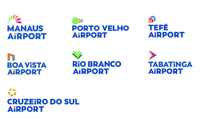
● The global company made a point of maintaining the roots of the Amazonian states.
● Elements of regional culture are highlights in the visual identity.
● Sense of place aims to showcase the best of what the cities have to offer.
● The idea is for people to perceive the cultural identity of the cities, their peculiarities, and differentiators.
VINCI Airports, the leading private airport operator in the world, took over the management of 7 airports in the Northern region of Brazil with the proposal, already underway, to inaugurate a new perspective and a differentiated experience on the concept of flying and occupying spaces related to the environments where it is installed.
An important part of this direction is the visual identity that the company created for each of the terminals. They are now the masters of ceremony of the spaces managed by VINCI Airports, with their lines and strokes that aim to bring the image of Amazonian elements to the world, as well as allowing a connection between travelers, tourists, and crew with the beauties and differentiators of each state they will be passing through.
A global company, VINCI made a point of maintaining local roots in the airport brands. "The idea is for each airport to have its roots with the city and for this perception of identity to be felt by those who arrive. This translates not only into the brands but also into the movements that become part of the daily life of the airports, such as events, exhibitions, and mentions of local cultural festivals," says Karen Strougo, CEO of Amazon Airports.
The result was 7 logos rich in colors and content. To reach the final point, the designers explored:
● Immersion in the culture of each state dimensioned the characteristics and elements to be created.
● A study and research of cultural symbols were conducted.
● Analysis of demographic, social, and economic data of the states.
● Manaus Airport: the Manaós
The logo was inspired by the attire of the Manaós, one of the most important ethnic groups that inhabited the region and gave rise to the city of Manaus. They are considered symbols of indigenous resistance in Brazil. The headdress, the macaw, the Amazonas flag, and the green of the forest resulted in a light and colorful logo.
● Boa Vista Airport: gateway to the future
The airport of the capital of Roraima received a logo that represents one of the landmarks of its urban architecture, the arch inaugurated in 2000, which, by celebrating the arrival of the year, evokes good vibes for those who pass through it. The always blue sky of Boa Vista, the colors of the birds, and the fruits gave a unique tone to the brand.
● Porto Velho Airport highlights
The Three Marias The logo of Porto Velho Airport emphasizes one of the main symbols of the city's development process, represented by the monument The Three Marias. Printed on the municipality's flag, these century-old storage structures were responsible for the water supply and, consequently, the socio-economic advancement of the people of Rondonia. The colors are green, orange, and blue.
● Rio Branco Airport and the latex saga
The extraction of rubber is one of the most representative elements of the state of Acre, and the grooves formed in the rubber trees by the activity became the graphic concept of the airport's logo in the Acrean capital. Rio Branco, which developed with the rubber plantations as a starting point, today gathers a rich cultural heritage of gastronomy, music, and cultural expressions around the rubber culture. Various shades of green compose the logo.
● Tabatinga Airport: bow and arrow
Immersion in the roots of Tabatinga's culture led to a connection with one of the main symbols of the culture of the original peoples, the bow and arrow. The logo draws a similarity between the idea of flight and the symmetrical triangular shapes of the bow and arrow. Red, orange, and blue are the predominant colors.
● Tefé Airport highlights the Brazil nut tree
An important part of the economy of the municipality of Tefé, the production of Brazil nuts is now a symbol of Tefé Airport, using the Brazil nut leaf as an element and drawing a parallel with the idea of flying by plane. It is the story of Tefé told from the perspective of the Brazil nut tree, with its cultural and historical nuances. Blue, red, and orange give a special color to the logo.
● Cruzeiro do Sul Airport vibrates with marquetry
Wooden inlays, with colors, shapes, and textures, applied perfectly, set the tone for the artistic expression that increasingly captures the world's attention, reinforces local culture, and represents a new economic opportunity for young people from the rubber plantation. This is marquetry, which, combined with the symbol of a star, resulted in the logo of Cruzeiro do Sul Airport.

See our latest news
24 de Setembro de 2026
Manaus Airport Cargo highlights the logistical potential of Amazonas for the pharmaceutical industry at an event in São Paulo
27 de Agosto de 2026
Manaus Airport Cargo sets record in July with 11.6 thousand tons handled
26 de Agosto de 2026